I just got my Moto 360! Here’s a few impressions from my first day and a half with it. (Edited for expansion and corrections after a week)
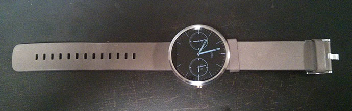
Firstly, hardware. As you’ve no doubt gathered from the gazillion reviews already out there, it’s got a very nice premium build, the metal housing (I got the silver/grey one) looks fantastic, just like a high-end watch should. What surprised me was that it’s actually really light, I expected a lot more heft from the steel casing and glass panel.
I was a bit let down by the leather band. Now, I haven’t worn a watch in ages, and use very little equipment that has any leather on it, so my opinion isn’t the most well-informed, but it feels a bit cheap to me, I’m tempted to say plastic, but it’s actually closer to thick, printed cardboard, if that makes sense. It also creaks. (edit: It still does after a week) On the other hand, the clamp looks really really nice. Love the flat design. Very sleek.
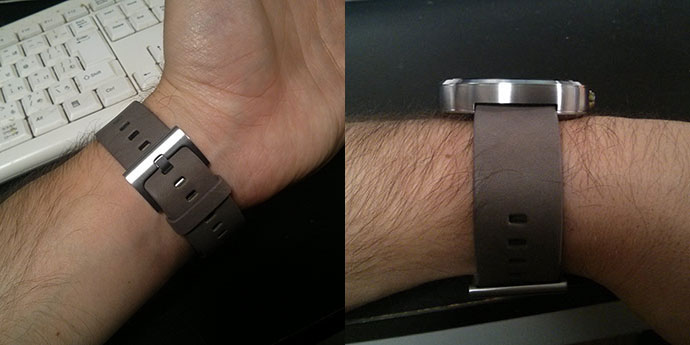
Photos also make it look pretty huge and thick, but it really doesn’t feel that way when it’s on the wrist. It’s about 4.5 cm wide and 1cm thick, so the shape probably makes it feel a little smaller.
Also a nice surprise: It charged from 30% to 100 in less than 2 hours (I’d read it would be 3-4), and the setup process was painless (provided one is patient enough to wait for the updates to finish before doing anything). Bluetooth connection has not been a problem for me so far either.
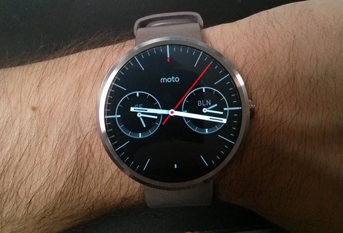
The screen, as you might have heard, doesn’t have the best pixel density, so if you look closely you can definitely see the pixels. And, as many have pointed out, the chamfered edge magnifies them, resulting in a lot of chromatic aberration on the edges when you have a bright watch face on. I have slight OCD-ish tendencies, so that bothers me a lot. I’m using the black faces, mostly the really nice triple-timezone one that comes preinstalled.
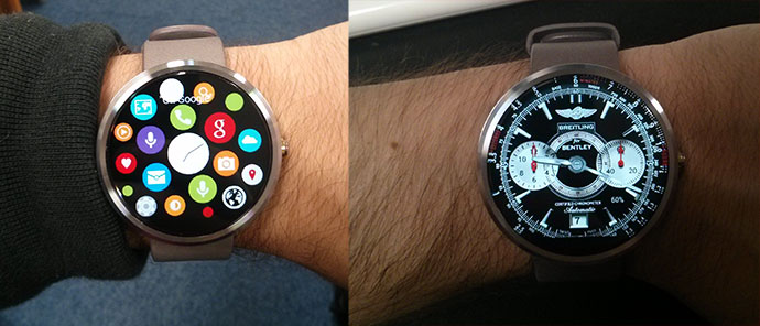
And of course, I slapped a few custom faces on there from the web, just for kicks (and, in the case of the fake apple watch face, trolling. Don’t worry, I deleted it pretty fast)
The big question is, what does it actually do?
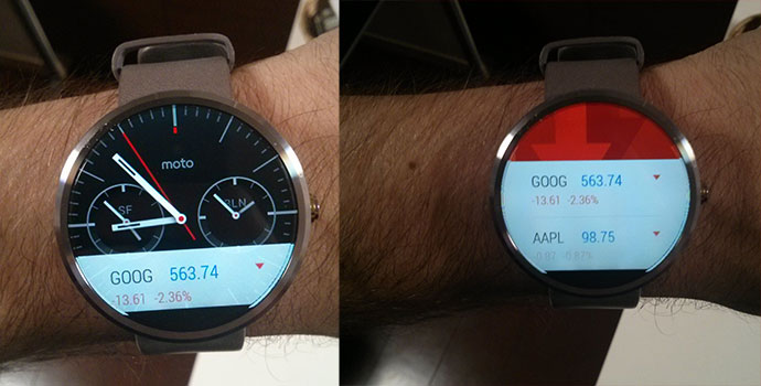
The first thing you’ll notice is that it mirrors all of the notifications on your phone, as well as Google Now cards. So if you don’t have access to a lot of Now cards (I think we get like half of the good stuff over here in Japan), or get a lot of notifications, it’s kinda boring. It kept bringing up the steps card, which is what it implies – an automatic pedometer step count that is always on. So far it feels pretty accurate, but I wasn’t that active today.
I’ve got that card disabled now, because it kept coming up again and again…
Cards pop up in a compact little strip at the bottom of the watch, and if you pull them up, expand into a pretty nice full-screen view. If you want to get rid of them completely, you have to swipe them away – some will expand to the right side, but if you swipe them off the left side they will disappear.
Which is a bit of a problem, because as anyone who’s used Google Now a bit will know, there’s no way to get them back. So if you swipe the weather card away, it’s gone until it decides to pop back up by itself (or if you tell the watch to “show me the weather”).
There is also no way to hide the cards and still have them appear when you swipe up, which annoys me to no end.
Edit: “Muting” the watch (drag down from the home screen) will ban all cards from the home screen. The watch won’t vibrate or light up for new notifications anymore, but if you swipe up all the cards are right there, so there’s no need to dismiss them completely.
Third-party notifications look nice as well. Here’s a few samples.
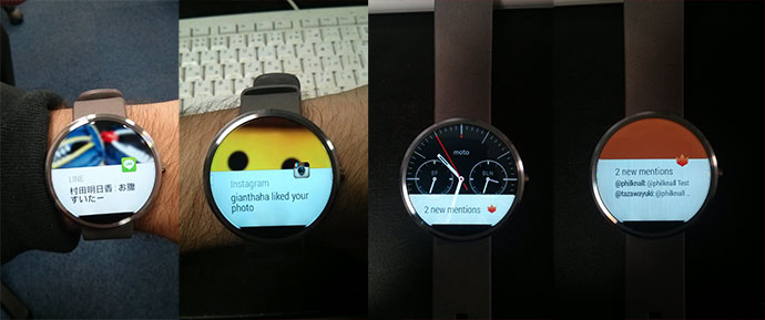
Personally, I’m happy with the LINE integration, as it gives me a glance at a message that allows me to judge whether I want to get my phone out and reply, or if it’s just a message from a corporate or news account. Edit: It actually now contains a Reply button on the expanded card (to the right), unfortunately all input is voice based so no multilingual input for now.
The watch can also actually run apps, although the option for this is kinda tucked away awkwardly – you have to tap the watch screen, which brings up the voice input menu, then scroll down from there through a pretty neat list of predefined actions (“take a note,” “remind me,” “show me my heart rate,” ‘send email to…,” and so on), and at the very bottom, it says “Start…” which will bring up a list of apps that are available on the watch. The neat part is, these get synced automatically from your phone, so you don’t have to go look for wear apps. If an app you are using on your phone has wear capability, it’ll show up.
Here’s what happens if you launch Google Keep (which I use for reminders and short notes a lot):
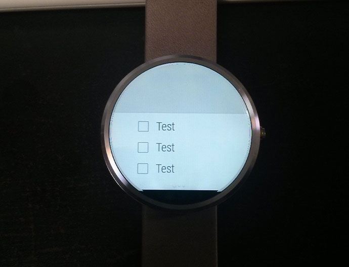 If you scroll down, it’ll show the rest of your notes, and even let you edit them, via voice input. (Which, thankfully, is great on Android) Unfortunately, it doesn’t give me the option to switch languages, or discern between them automatically, as my phone does. Hoping this will get added soon.
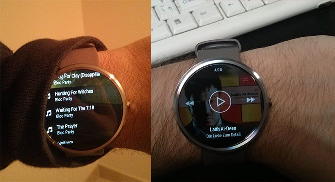
Another app that I’ve been using a lot is the Stellio Music Player. Without it, you already get simple “next/previous/stop” type controls when playing a song in Google Play Music, but with the Stellio player, you can actually launch the app from the watch, browse through your collection, and have a fully-fledged player on the watch, without ever getting out the phone. Great on the go and in crowded Japanese commuter trains. Paired with the clock, this is 99% of why I get my phone out when I’m on the go, so this is great for me.
Looks pretty nice, too!
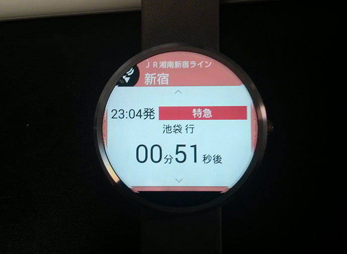
Of course, these apps aren’t perfect, especially the third party ones… As you can see in the first picture above, some content tends to get cut off because of the circular display, because the developers are clearly thinking more about the square ones like the Samsung Gear Live or the LG G Watch. A more jarring example is the Yahoo commuter app:
 No idea what the icon in the top left is even supposed to be. I was pretty excited to see that some Japanese developers are already working on this platform though.
When you fire up the camera on your phone, it gives you a remote shutter card, but that is pretty useless – It’s just a button without any way of telling what’s actually in the picture.
Luckily, there’s already an app called Wear Camera Remote, which does just that. So you can just put your phone down somewhere, position yourself and take a selfie remotely, which no doubt will create a stir in Japan because it enables you to take pictures from angles such as this:

Other apps that showed up on my watch were the preinstalled Google Fit and Motorola Connect, with another set of fitness-related options such as the heartbeat monitor and step counter (two options which I really like, btw. Always wanted to have a heartbeat monitor), as well as Runtastic. I also got Wear Mini Launcher, which is great to launch Wear apps faster without having to scroll to the bottom of that menu.
And that’s pretty much what I’ve been doing with it so far! I’m sure I’ll find some more apps to do, and Wear as a platform is bound to evolve fast, but this is what it’s good for right now. I have been pretty ambivalent about the actual need for such a thing, but I decided to jump on early because I was proven wrong about cellphones, smartphones, and tablets, so there.
There’s a few things I’d like to get remedied, such as not being able to hide the cards completely while still being able to swipe them up, but overall it’s a better experience than I expected.
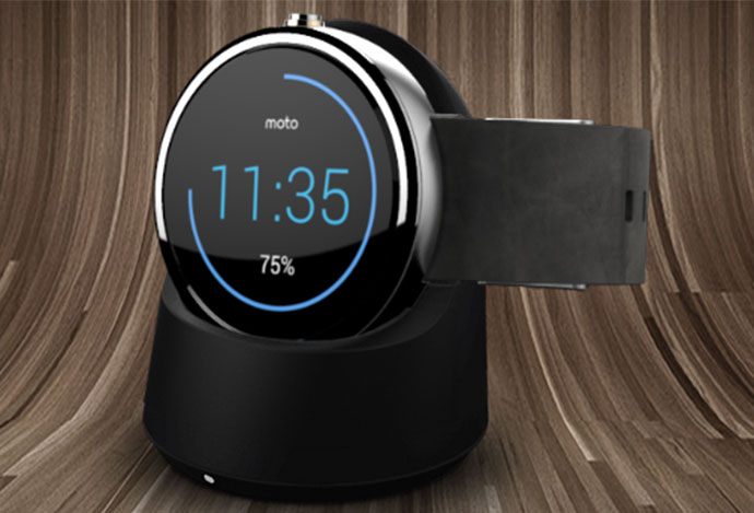
And lastly…. I know what you really wanted to ask me about. Battery life. It’s been ok. I have had Ambient Mode (screen always on) on purposefully, because I’ve heard it takes a pretty good bit out of the battery time. Additionally, I did everything you see above, both to entertain myself and test stuff, and to show others, so I’d say it was probably heavier use than I would get after getting used to it. I took it off the charger at 8:30 at 96%, and it is now 23:30, at 3%. So with ambient mode on, I got about 15 hours out of it. So if you’re looking for 2 days+, you’re out of luck. Thankfully, I wasn’t planning on that, and the charger turns it into a really nice table clock:
Edit from day two: Tried it without ambient mode on today, which means the screen goes completely dark when not in use. 8:15 off the charger at 100%, 85% after 4 hours, 70% after 8, 49% after 12, it is now 23:30 again and I still have 41% left. So turning ambient mode off definitely has a noticeable impact on battery life.

Pingback: Moto 360 Impressions 2 (11 days and counting) | PCK